



Case Studies



The Problem
Entrusted & Sent is the name of the 2021 capital campaign for Providence Church of Frisco—reflecting the missional identity of the church, along with the responsibility they bear as followers of Christ. Entrusted with the life-changing message of the gospel, and sent across the community to spread the good news.
Their goal over the next decade is to raise enough funds to meet the growing demands of their physical space, aim to launch 3 new local churches, send out 10 new missionary families, and expand their community groups threefold.
The client requested that their campaign logo be clean, inviting, colorful, hopeful, and visually compelling to reflect the powerful message.
The Solution
Inspired by an aerial view of hands about to clasp together, I created the logomark to abstractly and simply represent this with the cross in the middle. This portrays how Christ is central and His good news is shared between people of all walks of life. The two circles surrounding the cross are simultaneously sun rays and a globe, with the abstract hands also looking like mountains. The sun rays touch on the metaphor of Jesus being the light of the world, and the globe represents the great commission in making disciples of all nations. Paired with a clean all-caps sans-serif typeface—the same one already used by the church—unifies the brand as a whole and portrays clean stability.
The vivid color palette I selected, psychologically promotes feelings of hope, happiness, peace, trust, and an invigorating freshness that hints at new beginnings.
The DELIVERABLES
Logo Design and Simplified Brand Guidelines
The Results
Currently, they've exceeded their fundraising goal for phase one and will soon break ground on the new worship center.
"When I came on staff at Providence Church, one of my goals was to orchestrate heavy improvements in our visual brand and identity. Lindsay has been a significant part of that for us. She put together all of the brand work for our $5 million capital campaign and designed a 120 page booklet for our kids ministry in record time. She is timely, professional, and you can't argue with the quality. In creative work, dependability can be hard to find. You'll find it with Alera."
MATT MORRISON // Director of Communications
The Problem
The Jar Ministries is a new church plant and a movement of God intended to spread up the I-35 corridor from Ardmore to Oklahoma City and beyond.
The client needed help in visually communicating the idea behind 2 Corinthians 4:6–7 for their church brand: that we are all jars of clay— some broken, some shattered, all vulnerable—but God's glory can shine through all of us. The Jar Ministries seeks to appeal to people who are looking for purpose, for more in their life than they've discovered, who are tired, anxious, desperate for Someone to believe, or dissatisfied with the expressions of their faith they've encountered.
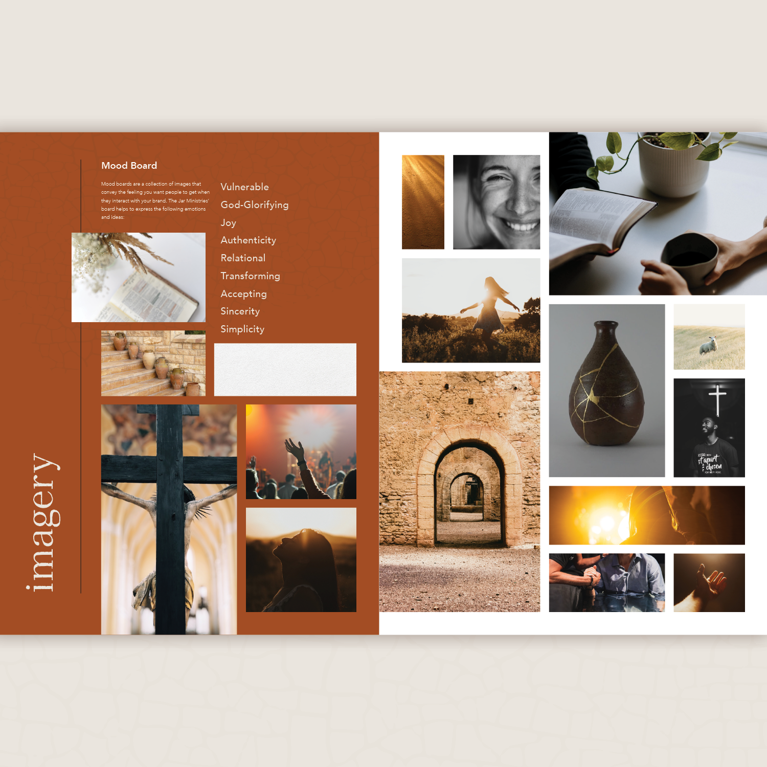
The top three messages the client wanted to communicate through their branding are: connecting real life to our extraordinary God, filled to be emptied, and taking our "am I?" questions to the Great I AM. They want to elicit emotions of joy, simplicity, sincerity, and acceptance.
The Solution
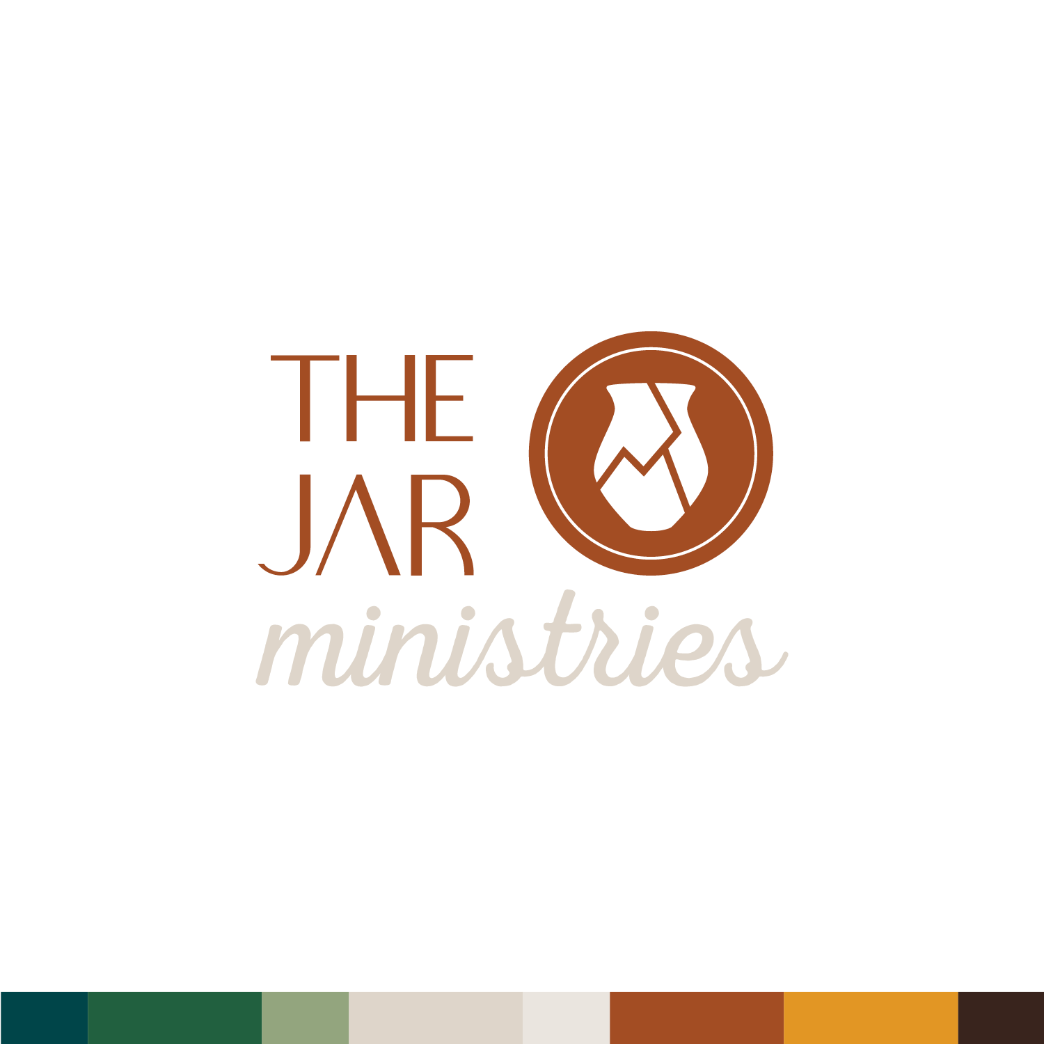
The shape of an ancient Hebrew clay jar, somehow still remaining intact with many cracks, was the main inspiring imagery used for the logomark. At a glance, the mark as a whole appears like an enclosed coin, which was intentionally done—with the circles representing light emanating from the jar and cracked edges, showing how God’s light colors our life. A modern, minimal sans-serif typeface paired with a clean script makes the wordmark bold, yet friendly. The missing crossbar in the “A” hints at both the uniqueness of each created person, as well as their brokenness—and yet, we can still be used for His glory.
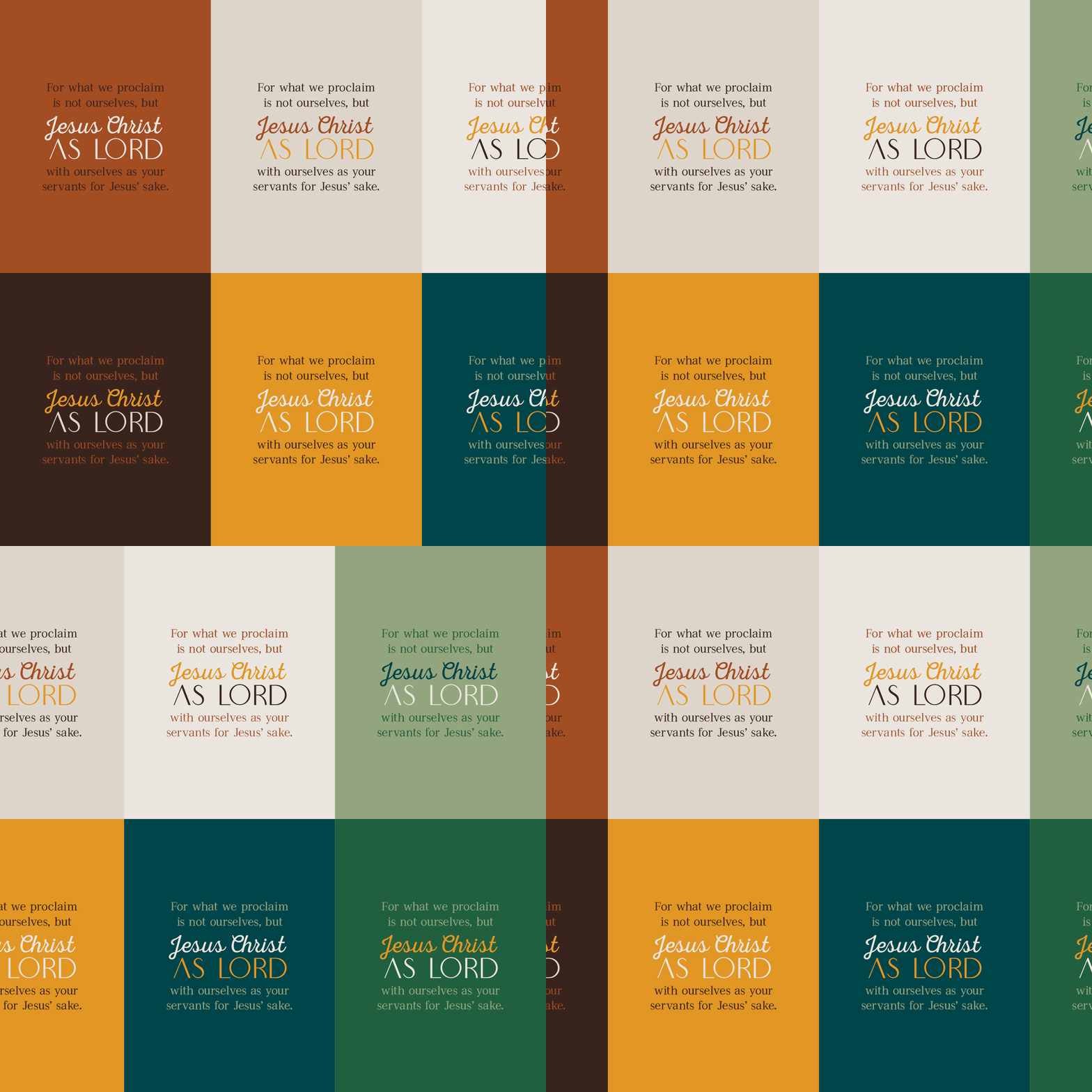
The brand's color palette features earth tones with a pop of gold. The rich colors paired with brighter neutrals and pasture-like cool tones, invoke emotions of warmth, cheer, modesty, life, growth, optimism, and healing.
The Deliverables
Logo Design and Brand Guidelines
The Results
"From the original brand questionnaire to the final brand style guide, Lindsay was professional and gifted. She heard our hearts and explored our thoughts until she knew exactly what we were seeking. Even better, she delivered! We are ecstatic about her work!"
MICHAEL ROGERS // President & Teaching Elder


The Problem
Little Light Pediatric Therapy exists to provide medically necessary skilled occupational therapy and feeding therapy services within a clinic setting to the pediatric population in Longview, Texas, and surrounding cities. They specialize in Sensory Processing Disorder, and also provide community education to empower parents in helping their children. Little Light's vision is to help each child reach their full potential so they can let their light shine brightly to the world in all they do, with Christ and His words in Matthew 5:16 as LLPT's leading value statement.
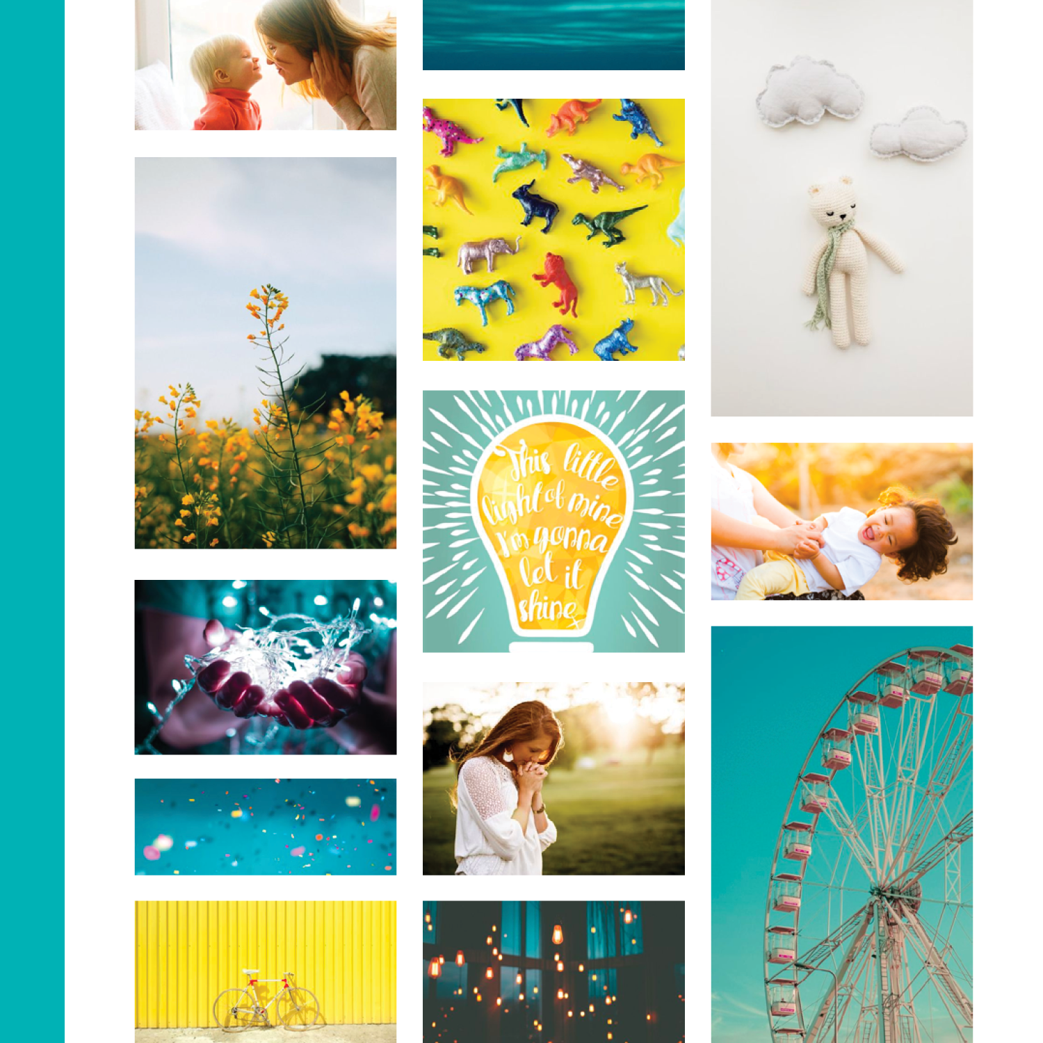
The client requested that their logo & branding reflect their Christian values and medically-professional mission statement. It needed to be kid-friendly while also appealing to parents, and promote both professionalism and trustworthiness. Of course, playing into the "light" theme was a must!
The Solution
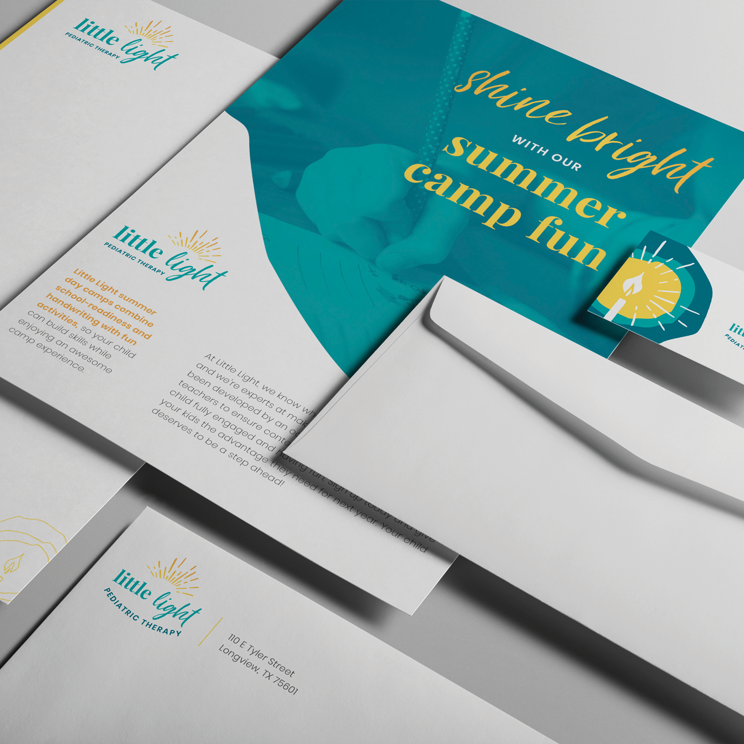
Light rays for the logomark were an obvious choice. Cleverly positioned over the middle-most "L" pulls the full logo together as a subtly embedded candlestick. The hand-drawn light rays combined with the handwritten script make the logo personable, playful, and light-hearted—which is just how great pediatric therapy should feel like for the kiddos involved, rather than a typical doctor's appointment. Paired with a modern serif typeface and a clean sans-serif with a slightly playful edge, make the text of the logo professional for parents to grasp the value and trustworthiness of the business, while still being kid-friendly.
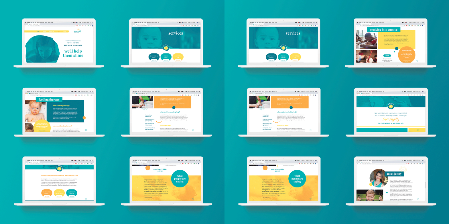
To make it even more personal and unique, we had the owner's son (age three at the time) paint/draw a sun. It turned out as a bit of a blob, but ended up working perfectly for the background shapes of the glowing candlestick graphic. We implemented this graphic on various design pieces, including the business card and website.
The Deliverables
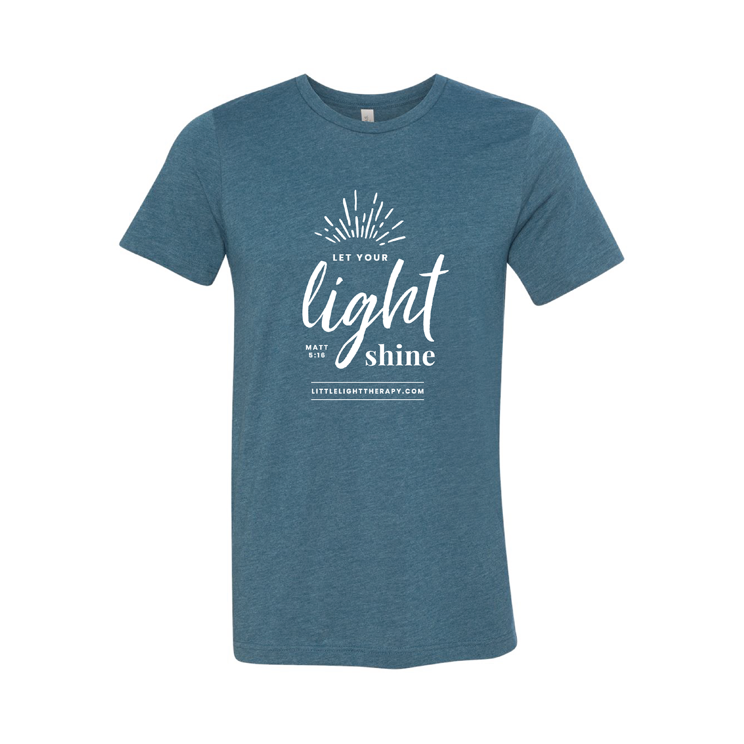
Main & responsive Logo Designs, Brand Guidelines, Custom Website Design on Wix, Signage, Postcards, Flyers, Bi-fold brochures, Ads, T-shirt designs, & other various marketing pieces
The Results
"I came to Lindsay with the name of my business, an inspiration piece, and the hope and dream of a well-known brand. As a new business owner, it felt like an unnecessary luxury to have her design my logo and website. However, what felt like a risk at the time, was truly an investment that turned out to be one of the best business decisions I've ever made. Through attentive communication, incredible design skills, and awe-inspiring insight, she crafted a vibrant brand that perfectly conveys the heart and purpose of my business.
Her expertise in branding and graphic design has solidified my presence in the market. Hands down, she's the best there is."
JENNIFER WILLIAMS // Occupational Therapist & Clinic Owner
